1. Introduction
- Why a Design System Matters
Consistency, speed, collaboration—and ultimately, a single source of truth for UI patterns. - Utility-First Frameworks to the Rescue
How Tailwind (or similar) flips “write CSS” into “compose classes,” making systems easier to maintain.
2. Core Principles of a Scalable System
- Atomicity & Reusability
- Build with the smallest possible units (e.g. btn, card, badge) and compose up.
- Theming & Tokens
- Centralize colors, spacing, typography in one config (Tailwind’s theme.extend) so you can swap dark/light mode or brand palettes in seconds.
- Responsive by Default
- Leverage mobile-first breakpoints (sm:, md:, lg:) everywhere—no separate media queries.
3. Setting Up Your Tailwind Config
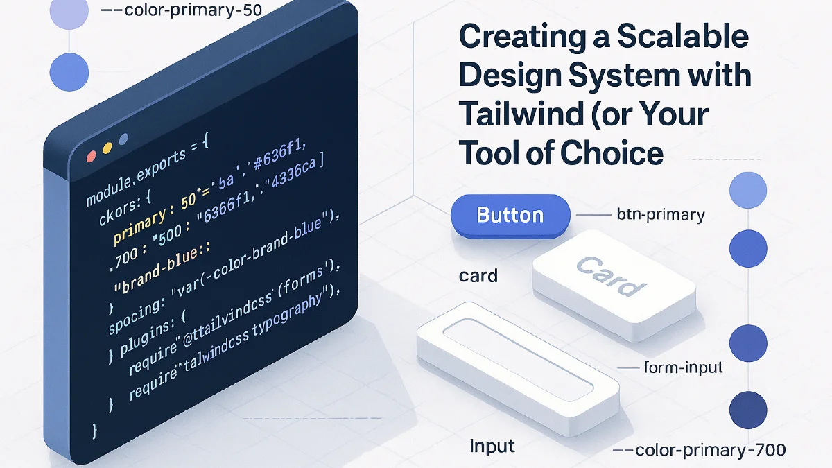
- Customizing tailwind.config.js
module.exports = { theme: { extend: { colors: { primary: { 50: '#eef2ff', 500: '#6366f1', 700: '#4338ca' }, // semantic aliases: 'brand-blue': 'var(--color-brand-blue)', }, spacing: { '9/16': '56.25%', // for fluid video embeds }, }, }, plugins: [ require('@tailwindcss/forms'), require('@tailwindcss/typography'), ], }- Design Tokens via CSS Variables
Map your tokens into :root so they’re available outside Tailwind, too.
4. Crafting Foundational Components
- Buttons
- Base styles: .btn { @apply inline-flex items-center px-4 py-2 rounded; }
- Variants: .btn-primary { @apply bg-primary-500 text-white hover:bg-primary-600; }
- Cards
- Utility wrapper: .card { @apply bg-white shadow-md rounded-lg p-6; }
- Responsive tweaks: add md:p-8 for larger screens.
- Form Inputs & Typography
- Use the official Tailwind Forms plugin to normalize inputs.
- Set up prose defaults for article content via the Typography plugin.
5. Organizing Your Codebase
- File Structure
src/ components/ Button.vue Card.jsx styles/ _tokens.css _base.css _utilities.css tailwind.config.js- Atomic Folder (optional)
Keep truly standalone utilities (e.g. .rotate-45 or .text-shadow) separate from “real” components.
6. Automation & Documentation
- Storybook or Tailwind Play
Spin up a living styleguide so designers and devs can preview <Button> variants side by side. - Docs in Markdown
Document your tokens, breakpoints, and usage patterns in a /docs folder—auto-generate with tools like Style Dictionary.
7. Theming & The Future
- Dark Mode
Tailwind’s dark: variants make swapping color tokens trivial. - Brand Extensions
Teach your team how to add new tokens (e.g. rose-300) without breaking existing components. - Versioning & Changelogs
Tag releases of your design system, bump breaking changes semantically, and keep a changelog so consumers know when to upgrade.
8. Conclusion & Next Steps
- Start Small: Turn your most-used component into a utility+component combo first.
- Iterate: Expand tokens and components as you build new features.
- Collaborate: Invite designers and QA to review your Storybook—shared ownership keeps the system healthy.